Hey,
I’m totally new to Badger stuff…
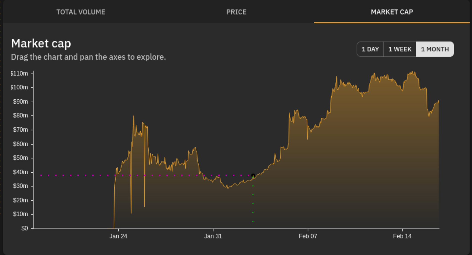
I was fooling around in the dapp, found some charts and started to interact with them only to find them awkward to use. If you digg enough visually on https://app.badger.finance/digg, you would immediately find yourself drawing imaginary lines(one to the west to find the rate and one to the south to find the time, see the attachement).
To fix this, I have two suggestions:
I) Showing some popup window to help the rate/time tracking
II) Drawing two perpendicular lines from where the mouse pointer is
Cheers,